Monday, May 20, 2013

Epic Dude!


Guy cards... where do you start? Despite taking the His and Her class from Jennifer Maguire and Kristina Werner, I still have a problem with them. 

This week's Fusion Challenge just spoke "guy" to me.

You are probably wondering where was the "guy' in the challenge? I think It was the colors. I was able to use a few new stamp sets. I used the Papertrey Ink Watercolor Wonder that I borrowed from a friend (I sooooo have to get this set now!). I added the sentiment from CAS-ual Fridays Rad set. I had no idea what to use for my image, when I came across a retired stamp from StampinUp. Perfect! Just love when the stars align! ( didn't I say that in another posting?!)

I am so totally set for a birthday card for my good buddy Ryan's birthday this summer- especially since he is so totally epic!


Sunday, May 19, 2013

Margarita- you're special!


A good friend of mine has a birthday at the end of May and she loves pink- no let me correct that- she loooooooooooves pink! As she says "It is the most beautiful color in the world!"

Naturally when making her card, the only color I could consider would be pink. The Friday Mashup is challenging us among other things to a monochromatic card. Well this was a no brainer huh?

Over at Tuesday Throwdown, they want you "to smell the roses". Roses, flowers pink- need I say more?

Finally the Crafty Creations Challenge want us to "kiss" "keep it simple sista"!!

I am not sure Margarita checks out my blog but this card is for her!

It is the start of another work week, so I may not be able to post until later in the week.


If it is May it must be weddings...


My best friend had three kids get married in the last year- 2 were the brides! That's a lot of weddings to plan and invitations to create. 

For me it was just as hard- wedding cards weren't soemting I normally make. I had to invest in some wedding type stamps. Enter Papertrey Ink- Love and Marriage. The tree and the sayings were perfect!
I stamped the tree with clear ink, I stamped the saying in back die ink and embossed with clear powder on pink paper. I then sponged a darker pink in the open areas.

Layer on white paper punched with hearts and then layered on an embossed with card.  There ya have it, a beautiful and elegant wedding card that matches the bride's colors of pink and white!

I am entering this in the challenge at ABC Challenges featuring wedding and anniversary cards.
Well now I am set for any future weddings that come my way!


Saturday, May 18, 2013

May your dreams blossom

Yesterday when I was driving home from work, I noticed that everything is blooming! I should have figured by the way I have been sneezing!

I love May, I love seeing the dogwoods, my sweet smelling vibernum, the irises showing off their beards, and the daffodils. The smells of spring just put you in a good mood.


In honor of all blooming things I created this card. At CAS-ual Fridays, they are challenging us to stamp on designer paper. I had to think about that one. I remembered my Hero Arts fabric backgrounds and thought yeah- that's the ticket. I stamped this background on several different sheets of DP, but none of them worked. You couldn't use anything to bold with too much color, it needed to be subtle. I found a pack of Basic Grey papers and the pink sheet worked great. I die cut and stamped the flowers and leaves from Papertrey Ink's Embroidered blooms set. All together you have that fabric, tapestry feel.

Another one of my favorite challenge sites- CASology is having us being inspired by the word "bloom". I think this card works for that challenge- don't you?

So even though it is cool spring day, my window to my studio is open and I can smell of blooming things.


Thursday, May 16, 2013

May flowers


A friend of mine was recently purging her studio. I grabbed a bunch of stamp from her. 
You might think the card above was made from  stamps I grabbed from her.... but no... these are from stamps i haven't used in a while. The flowers are from Hero Arts ( I don't think it is available any more- what a shame!) and the pot is from Rubber Necker. It is amazing how  both the flowers and the pot match up perfectly. The saying is from the now gone Lizzie anne stamps- these are from my friend's purging.


Because I can not leave well enough alone, I added a bird from Papertrey Ink. What fun! Her are some other cards I did.

Hope you enjoyed these-


Sunday, May 12, 2013

What's the word, bird?

The challenge at Fusion is always that a big challenge. The challenge is threefold, you can follow the sketch or  the photo inspiration or combine the two.

I like to combine the two. But not only did I do the fusion,  but I added a wood grain touch that the folks over at Just Add Ink were looking for in their challenge.
Just love the bright birds (from Darcies Stamps) against the gray wood embossed flag.

Well... this was a great way to spend Mom's day- stamping and sharing.

Here's to all the Mom's out there!


Saturday, May 11, 2013

With Sympathy

Sympathy cards are always hard to create. I have found the more simple the better. The father of one of my husband's friends recently died. Using several challenges as inspiration I came up with this card. The idea of not using your common white, cream, black or kraft paper as the basis of the card was the challenge at Less is More was perfect for this sympathy card. Over at Just Us Girls we were asked to just use a white medium as the focus. Using my fav Paper Smooches set Reflections, I stamped the flowers in white and added a saying from an unknown StampinUp set. To create some interest i added a few white pearls. This card feels so soothing to me and I hope it will to the wife.


I also went all out and did the inside of the card. The challenge at My Time to Craft was the inside of a card. Normally this is something I never do, so this was a challenge. I thought creating the negative of the outside of the card would work perfectly. What do you think?

Don't you just love when all the stars align and come up with a great idea! I can see me trying this idea with our colored card basis and stamps.


Wednesday, May 8, 2013

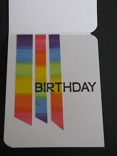
Rainbow Birthday


Wow I just love my new job! I got downstaffed today, so I had an extra day off this week! I got my homework done quickly and then spent some time stamping.


I went through the challenge blogs for some inspiration and came up with this card. It answers the challenge to 4 challenges. First Addicted to CAS  is having a challenge with the inspiration of rainbows.
Next Addicted to Stamps and More is having a clean and simple challenge- love those!
Make my Monday features anything that flies. Lastly My Time to Craft  challenge is having a sentiment as the main focus.

ADDED NOTE 5/12/13

My Time to Craft  is having us a show us the inside, so I went back and did the inside of my top three card. I had these rain bow strips in my stash from another project and thought they would be perfect in the inside of this card. I am having fun doing the inside of a card- something I never do. I think the trick is to make sure it complements the front of the card but doesn't take away from the front.


The fun thing about this card is the technique I used with happy saying stamp from Hero Arts. I turned the stamp over and attached the word part to the acrylic mount, so the flat acrylic side was up. I then took my Tombo markers and colored a rainbow on the stamp.


I liberally spritz it with water and stamped onto white card stock. When it was dry, I turned the stamp over and inked the "happy saying" and stamped it in the rainbow block. It fit perfectly! 
Try it! It works great!


What do you think about the balloons? I went back and forth about adding them. I just felt it needed something.
Happy Creating!


Thursday, May 2, 2013

His and Her Cards


Just catching up on lessons from the His and Her online card class. Lots of fun ideas. I got this idea from the video Jennifer Maguire showed on class 2. She was focusing on maculine cards but showed how she converts feminine cards into masculine cards and one card layout struck me. 

I switched this up a bit. generally guys and kraft paper go together. But on my girly card i matched the kraft paper up with some feminine quilt paper fro StampinUp and added a pink strip with the saying- curly for the ladies. I then added some matching buttons.

The guy card I went with some stark white, and layered some old newsprint paper from DaisyD. The saying I put on the kraft and had it plain typewriter font. I added some guy buttons and screw brads. 

Now I know it was a birthday card day today, but I hope it is OK these to the gallery since they are Hello cards.

These also reminded me of the sketch challenge over at Less is more, so I am entering both of these there.

You know what these could be great mom and dad cards, maybe I will put them in that gallery, oh I don't know, what do you think?